There is plenty of skepticism around the value of hackable products. Significantly, hackability is different from openness: cars are closed-source, yet support vibrant modding communities; gcc is one of the “real OG”s of open source, but few users find it easy to extend or enhance. Is it better to have a garden planted by the most knowledgeable botanists and maintained by experienced gardeners, or an open plot of land maintained by whoever has the interest and time?
In the case of hardware products, consumer behavior consistently affirms a strong preference for well-curated gardens. Hardware is hard – not only is it difficult to design and validate, supply chains benefit from economies of scale and predictable user demand. The larger a captive audience, the more up-front money one can invest into developing a better hardware product. However, every decision to optimize comes with inherent trade-offs. For example, anytime symmetry is broken, one must optimize for either a right-handed or a left-handed version.

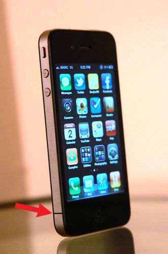
Some may recall a decade ago, when the iPhone 4 was launched, left-handed people noticed the phone would frequently drop calls. It turned out the iPhone 4 was designed with a critical antenna element that would fail when held naturally by a left-handed person. The late Steve Jobs responded to this problem by telling users to “just avoid holding it that way”. Even if he didn’t mean it, I couldn’t help but feel like he was saying the iPhone 4 was perfect and left-handers like me were just defective humans who should be sent to re-education camps on how to hold things.
Of course, as a hardware engineer, I can also sympathize with why Steve Jobs might have felt this way – clearly, a huge amount of effort and thought went into designing a technical masterpiece that was also of museum-quality construction. It’s frustrating to be told, after spending years and billions of dollars trying to build “the perfect product” that they somehow got it wrong because humans aren’t a homogeneous population. Rumors have it Apple spent tens of millions of dollars building micron-precision production jigs out of injection-molding grade tooling to ensure the iPhone4 was simply perfect in terms of production tolerances; duplicating all of those to make a mirror-image version for left-handers that make up 10% of the market size just made no business sense. It proved to be cheaper and easier, ultimately, to take full refunds or to give out rubber bumpers to the users who requested them.
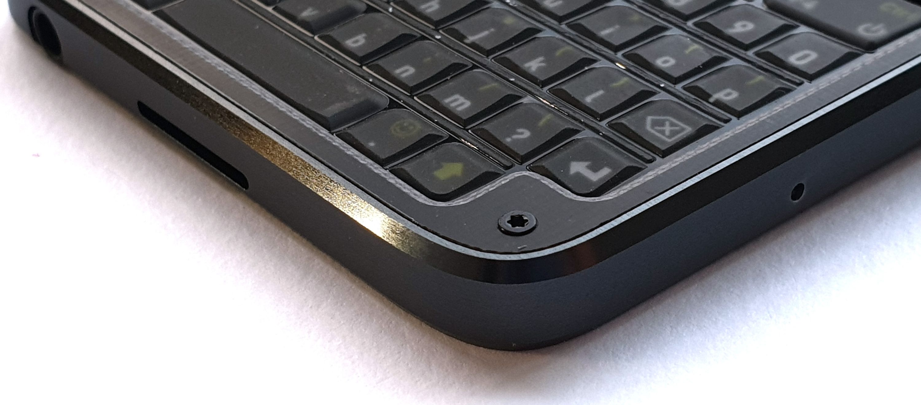
I do think there is such a thing as “over-designing” a product. For example, contemporary “high concept” smartphone design is minimalist – phone companies have removed headphone jacks, hidden the front camera, and removed physical buttons. There is clearly no place for screws in this world; the love affair of smartphones and adhesives has proven to be … sticky. Adhesives, used in place of screws in modern smartphones, are so aggressive that removing them either requires additional equipment, such as a hot plate and solvents, or simply destroying the outer bezel by breaking the outer case off in pieces and replacing it with an entirely new bezel upon re-assembly. In other words, hacking a modern smartphone necessarily implies the destruction or damage of adhesive-bound parts.
With Precursor, I’m bringing screws back.
Precursor’s screws are unapologetic – I make no attempt to hide them or cover them with bits of tape or rubber inserts. Instead, I’ve sourced custom-made Torx T3 metric screws with a black oxide finish that compliments the overall color scheme of Precursor. Six of them line the front, as a direct invitation for users to remove them and see what’s inside. I’ve already received ample criticism for the decision to show screws as “primitive”, “ugly”, “out of touch with modern trends” — but in the end, I feel the visual clutter of these six screws is a small price to pay for the gain in hackability.
Of course, the anti-screw critics question the value of hackability. Surely, I am sacrificing mass-market appeal to enable a fringe market; if hackability was so important, wouldn’t Apple and Google already have incorporated it into their phones? Wouldn’t we see more good examples of hackability already?
This line of questioning is circular: you can’t get good examples of hacks until you have made hackable products wide-spread. However, the critics are correct, in a way: in order to bootstrap an ecosystem, we’re going to need some good examples of why hackability matters.
In the run-up to crowdfunding Precursor, I was contemplating a good demo hack for Precursor. Fortuitously, a fellow named Matt Campbell opened a GitHub issue requesting a text-to-speech option for blind users. This led me to ask what might be helpful in terms of a physical keyboard design to assist blind people. You can read the thread for yourself, but I’ll highlight that even the blind community itself is divided on whether or not there is such a thing as the “blind ghetto” — an epithet applied by some users who feel that blindness-specific products tend to lag behind modern smartphones, tablets, and laptops. However, given that most modern gadgets struggle to consider the needs of 10% of the population that’s left-handed, I’m readily sympathetic to the notion that gadgets make little to no concession to accommodate the even smaller number of blind users.
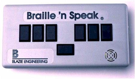
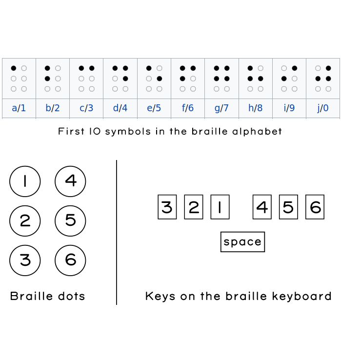
Matt was articulate in specifying his preferred design for a pocketable keyboard. He referred me to the “Braille ‘n Speak” (shown above) as an example of an existing braille keyboard. Basically, it takes the six dots that make up braille, and lines them up horizontally into three left and three right sets of buttons, adding a single button in the middle that functions as a space bar. Characters are entered by typing chords that correspond to the patterns of the six dots in the braille alphabet. Not being a braille user myself, I had to look up what the alphabet looked like. I made the guide below based on a snippet from Wikipedia to better understand how such a keyboard might be used.
Ironically, even though Matt had linked me to the picture of the Braille n’ Speak, it still took a while to sink in that a braille variant of Precursor did not need a display. I’m a bit ashamed to admit my first sketches involved trying to cram this set of switches into the existing keyboard area of the Precursor, without first removing the display entirely. I had to overcome my own prejudice about how the world should look and it took me time and empathy to understand this new perspective.
Once I had a better grasp of Matt’s request, I set about designing a customized braille variant. Precursor was designed for this style of hacking: the keyboard is a simple 2-layer PCB that’s cheap and easy to re-design, and the front bezel is also a PCB, which is a bit more expensive to redesign. Fortunately, I was able to amortize setup costs by bundling the braille front bezel variant with another variant that I had to fabricate anyways for the crowdfunding campaign. Beyond that, I also had to come up with some custom key caps to complement the switches.
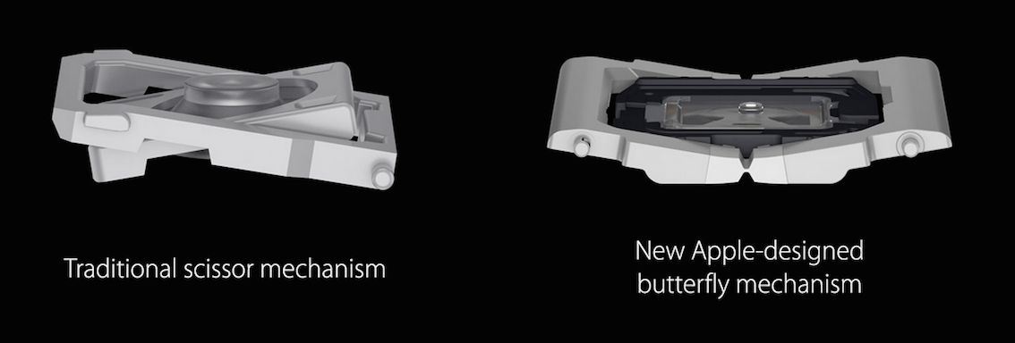
The major challenge in designing any type of mobile-friendly keyboard is always a trade-off between the hand feel of the switches, versus thinness of the overall design. On one side of the spectrum, full-travel mechanical switches have a wonderful hand feel, but are thicker than a sausage. On the other side of the spectrum, dome switches and printed carbon ink patterns are thinner than a credit card, but can feel mushy and have a limited “sweet spot” — the region of a key switch with optimal tactile feedback and operational force curves. The generally well-regarded Thinkpad keyboards go with a middle-ground solution that’s a few millimeters thick, using a “scissor” mechanism to stabilize the key caps over a silicone dome switch, giving individual keys a bit of travel while ensuring that the “sweet spot” covers the entire key cap. Optimizing key switch mechanisms is hard: some may recall the controversy over Apple’s re-design of the MacBook’s keyboard to use a “butterfly” mechanism, which shaved a couple mm of thickness, but led to lawsuits over a defect where the keyboard allegedly stopped working when small bits of dust or other particles got trapped under it.
Given the short time frame and a shoestring budget, I decided to use an ultra-thin (0.3 5mm) tactile switch that I could buy off-the-shelf from Digi-Key and create custom key caps with small dimples to assist users in finding the relatively small sweet spots typical of such switches. I have sincere hopes this is a pretty good final solution; while it lacks a scissor mechanism to spread off-centered force, the simple mechanism meant I didn’t have to stick with a square key cap and could do something more comfortable and ergonomic to focus forces into the sweet spot. At the very least, the mechanism would be no worse than the current mechanism used in Precursor’s existing keyboard for sighted users, which is similarly a dome switch plus a hybrid-polymer key film.
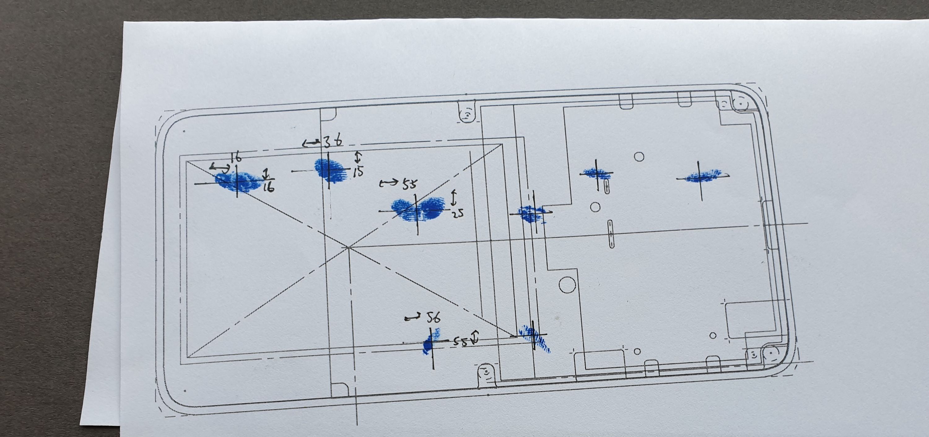
Next, I had to figure out where to place the switches. To assist with this, I printed a 1:1 scale version of the Precursor case, dipped my fingertips in ink, and proceeded to tap on the printout in what felt like a natural fashion.
I then took the resulting ink spots and dimensioned their centers, to place the centroid of each key cap. I also asked my partner, who has smaller hands, to place her fingers over the spots and noted the differences in where her fingers lay to help shape the final key caps for different-sized hands.
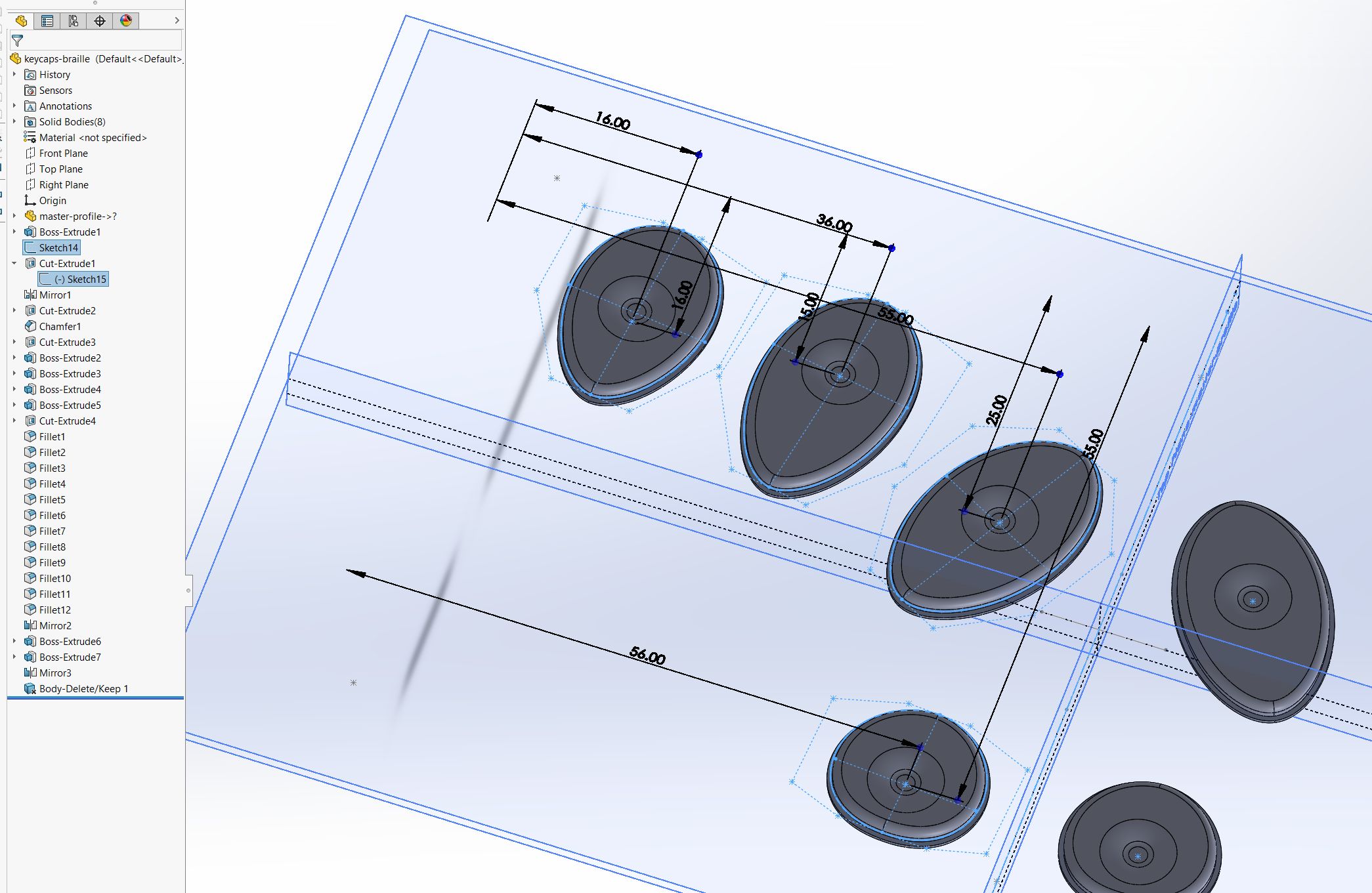
Next, using the “master profile” discussed in the previous post on Precursor’s mechanical design, I translated this into a sketch to help create a set of key caps based on splines that matched the natural angle of fingers.
Above, you can see an early sketch of the key caps, showing the initial shape with dimples for centering the fingers.
Before moving ahead and spending a few hundred dollars to build a functional prototype, I decided to get Matt’s feedback on the design. We submitted the design to Shapeways and had a 3D print sent to Matt, which he graciously paid for. After receiving the plastic dummy, his feedback was that the center space bar should be a single key, instead of two separate keys, so I merged the two separate key caps of the space bar together into a single piece, while retaining two separate switches wired in parallel under the space bar. I felt this was a reasonable compromise that would allow for a “sweet spot” that serviced lefties as well as righties.
I then re-designed the keyboard PCB, which was a fairly simple task, because the braille keyboard consists of only eight switches. I just had to be careful to pick row/column pairs that would not conflict during chording and be sure to include the row/column pairs necessary to turn Precursor on after being put to sleep. I also redesigned the bezel; eliminating the display actually makes manufacturing a little bit easier because it also removes a beveling step in the manufacturing process. I kept the RF antenna in exactly the same location, as its design was already well-characterized and it takes a lot of effort to tune the antenna. Finally, I decided to manufacture the key switches out of aluminum. The switches have a lot of fine features and I needed a stiff material that could translate off-target force to the key switches to enlarge the sweet spot as much as possible.
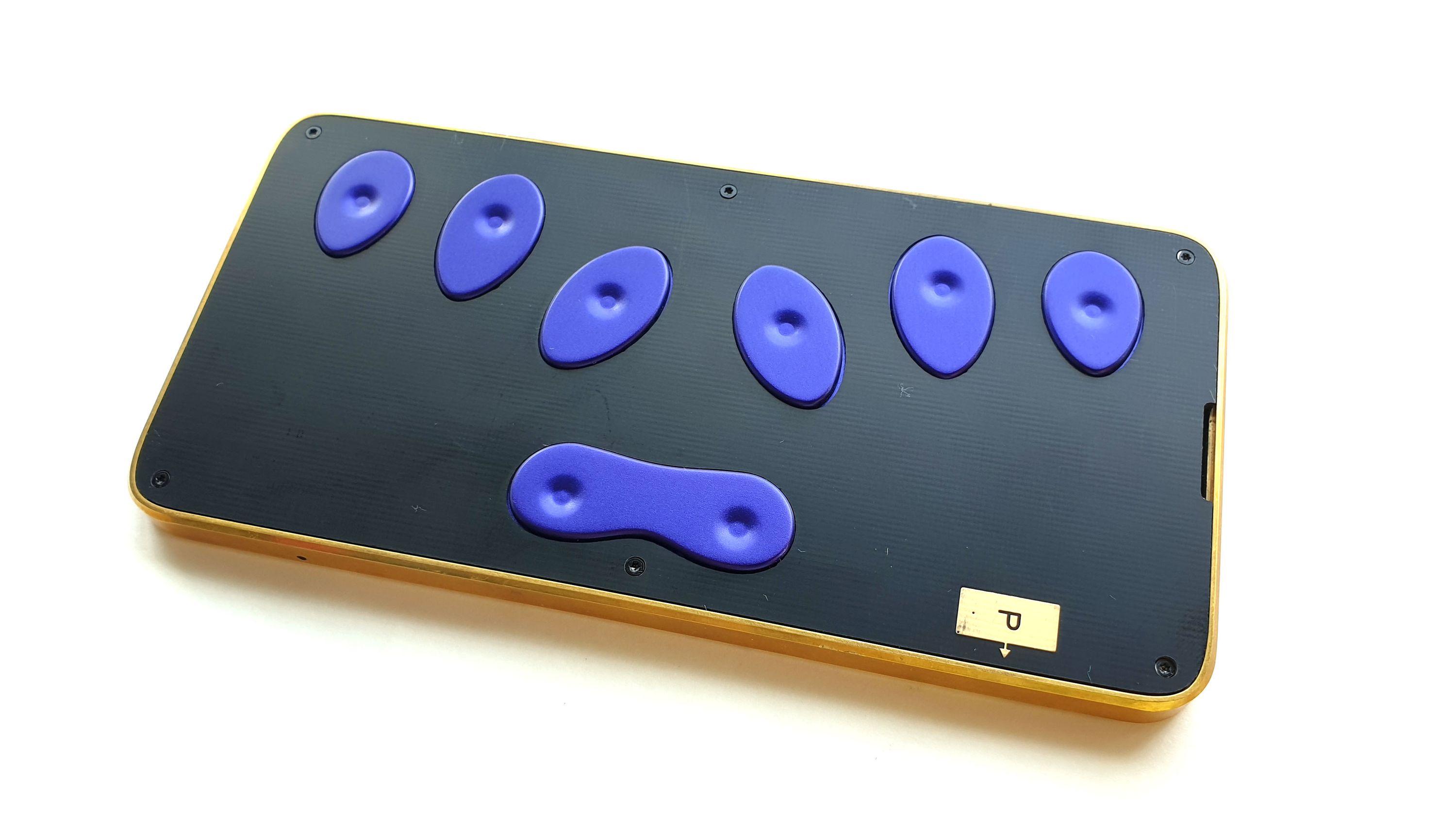
About three weeks later, all the parts for the braille keyboard had arrived. I decided to use purple anodization for the key switches which, combined with the organic key shapes, gives the final design a bit of a Wakanda-esque “Black Panther” aesthetic, especially when mounted in a brass case. The key switch feel is about in line with what I imagined, with the caveat that one of the switches feels a little less nice than the rest, but I think that’s due to a bad solder job on the switch itself. I haven’t had a chance to trace it down because…well, I’ve had to write a bunch of posts like this to fund Precursor. I have also been working with Xobs to refactor Xous in hopes of putting together enough code to send Matt a prototype he can evaluate without having to write gobs of embedded hardware driver code himself.
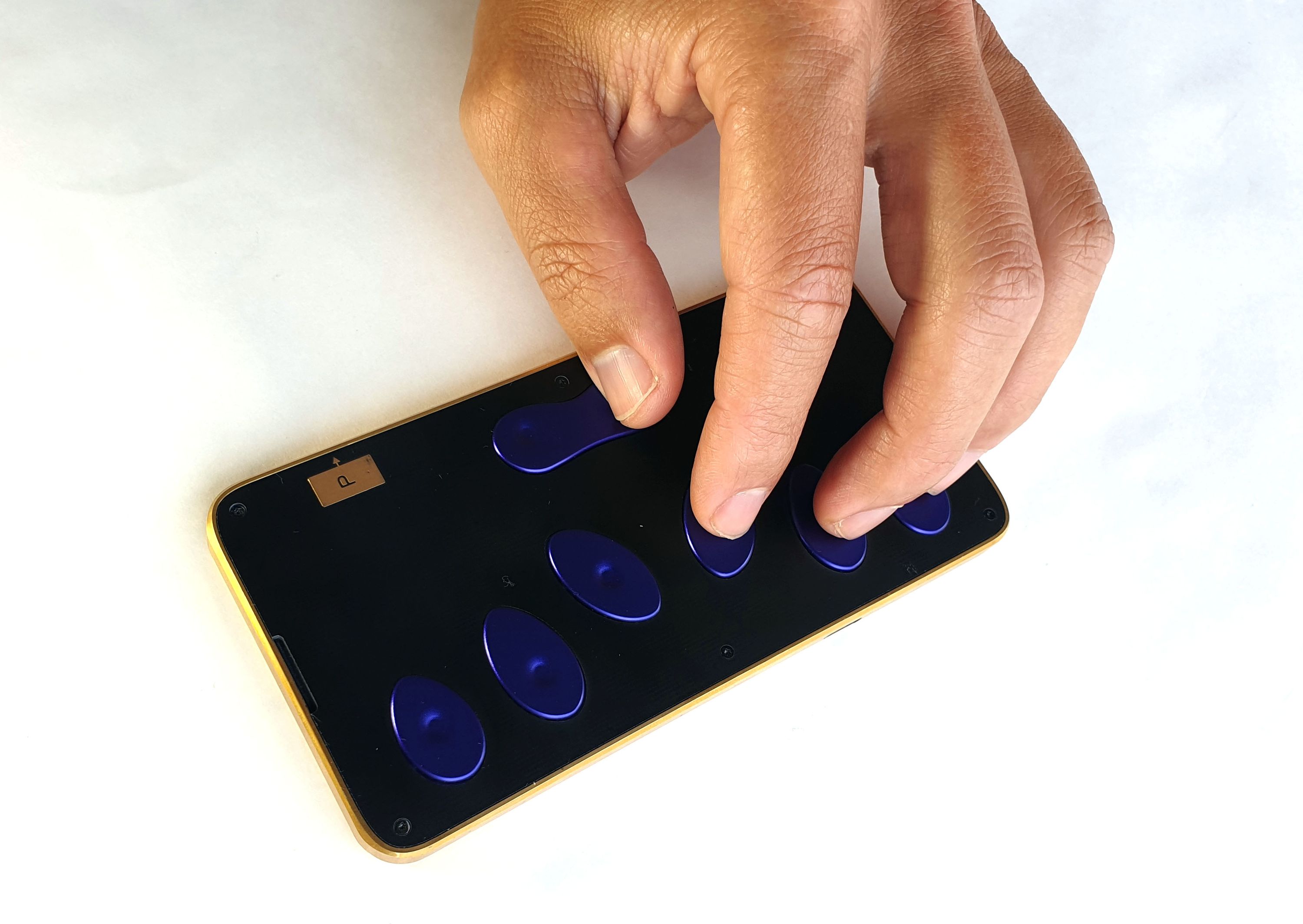
Above is a quick photo showing the alignment of fingers to keys. Naturally, it’s perfect for my hand because it was designed around it. I’m looking forward to hearing Matt’s opinion about the feel of the keys.
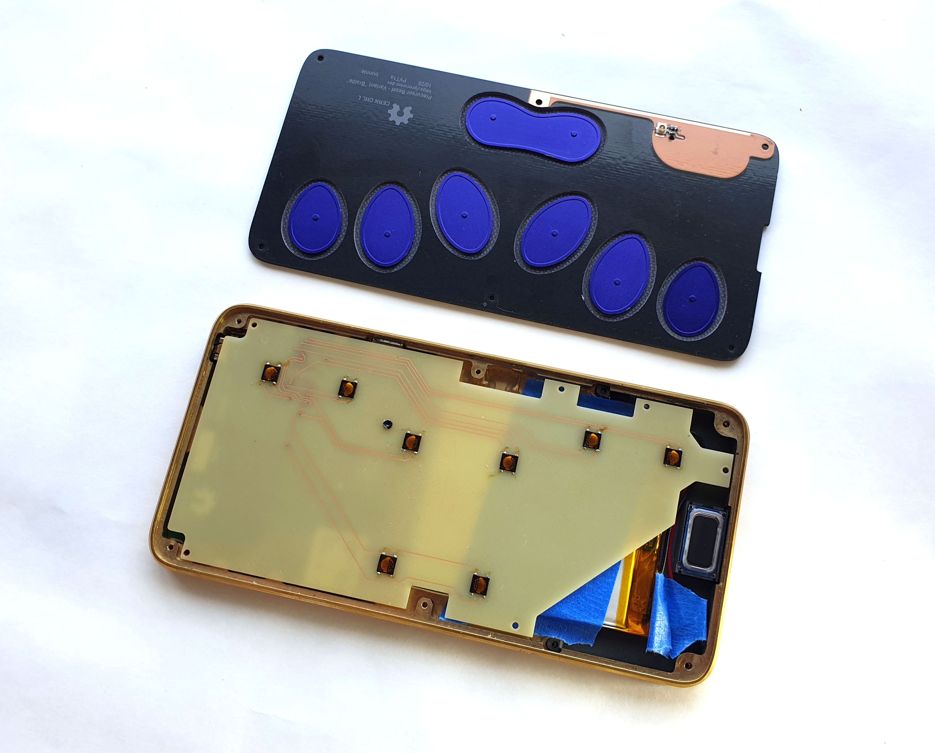
Above is a photo of the custom parts for the braille keyboard. At the top, you can see the custom bezel with key caps and the RF antenna matching circuitry on the top right. On the bottom, you can see the custom keyboard PCB mounted onto a Precursor motherboard. The keyboard PCB is mostly blank and, because of the small number of keys and the flexibility of the FPGA, there’s an option to mount more peripherals on the PCB.
Despite not being yet finalized, I hope this exercise is sufficient to demonstrate the potential value of hackable products. The original design scope for Precursor (née Betrusted) did not explicitly include a braille keyboard option, but thanks to modular design principles and the use of accessible construction materials, I was able to produce a prototype in about a month that has a similar fit and finish as the mainstream product.
As long as humans choose to embrace diversity, I think hackability will have value. A notional “perfect” product implies there’s such a thing as a “perfect” user. However, in reality, even the simple conundrum of left- or right-handedness challenges the existence of a singular “perfect” product for all of humanity. Fortunately, accommodating the wonderfully diverse, quirky, and interesting range of humanity implicates just a few simple engineering principles, such as embracing screws over adhesives, openness, and modularity. That we can’t hack our products isn’t a limitation of physics and engineering. Precursor demonstrates one can build something simultaneously secure and hackable, while being compact and pocketable. This suggests the relative lack of hackable products on the market isn’t a fundamental limitation. Maybe we just need a little more imagination, maybe we need to be a little more open-minded about aesthetics, and maybe companies need to be willing to take brave steps toward openness and inclusivity.
For Apple, true “courage to move on and do something new that betters all of us” was to remove the headphone jack, which resulted in locking users deeper into a walled-garden ecosystem. For hackers like myself, our “courage” is facing blunt criticisms for making “ugly” products with screws in order to facilitate mods, such as braille keyboards, in order to expand the definition of “all of us” beyond a set of privileged, “perfect” users.
I hope this braille keyboard is just the first example of many mods for Precursor that adapt the product for unique end-users, bucking the trend of gaslighting users to mold their behavior and preferences to fit the product. If you’ve got an itch to develop your own yet-to-be-seen feature in a mobile device, please visit our crowdfunding campaign page to learn more about Precursor. We’re close to being funded, but we’ve only got a week left in the campaign. None of this becomes a reality without hitting our crowdfunding goal on December 15th – if you like what you see, please consider helping us to bring Precursor to life!


